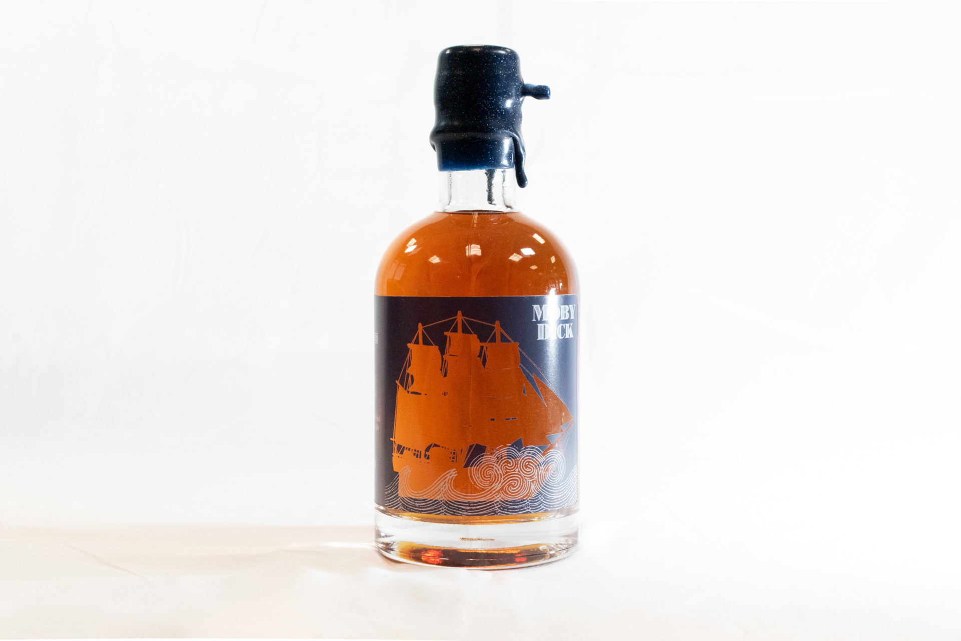
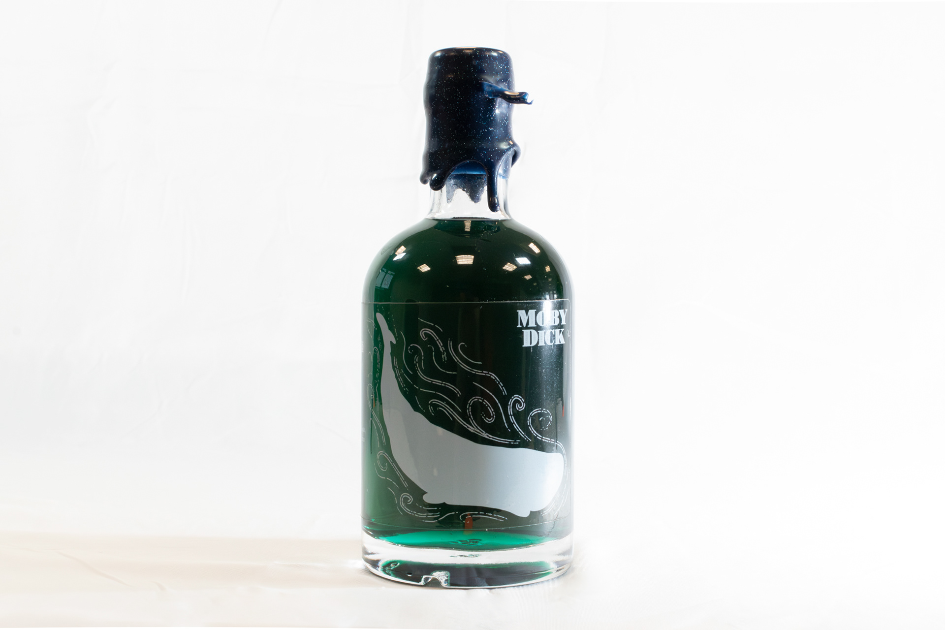
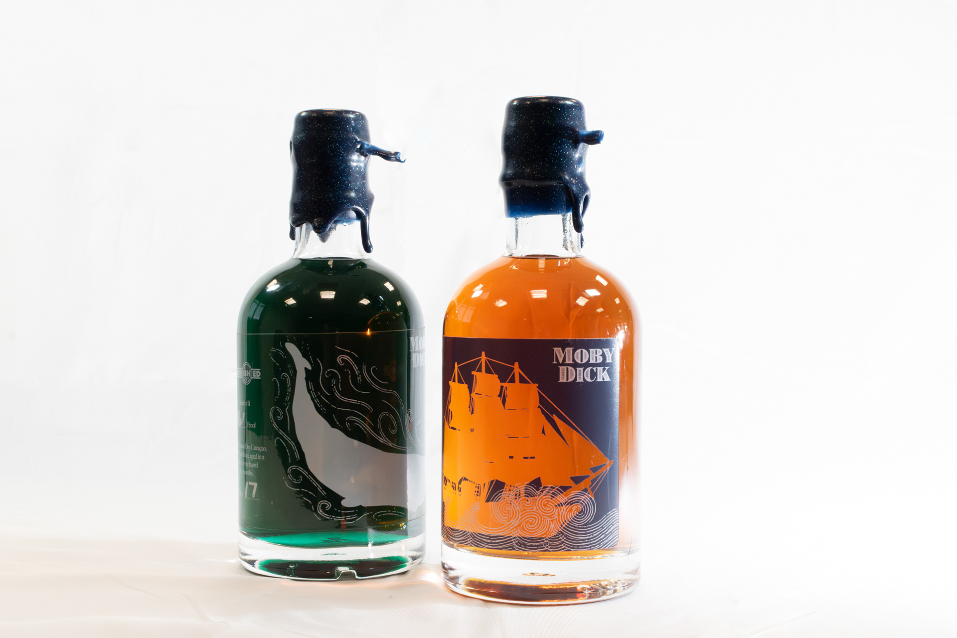
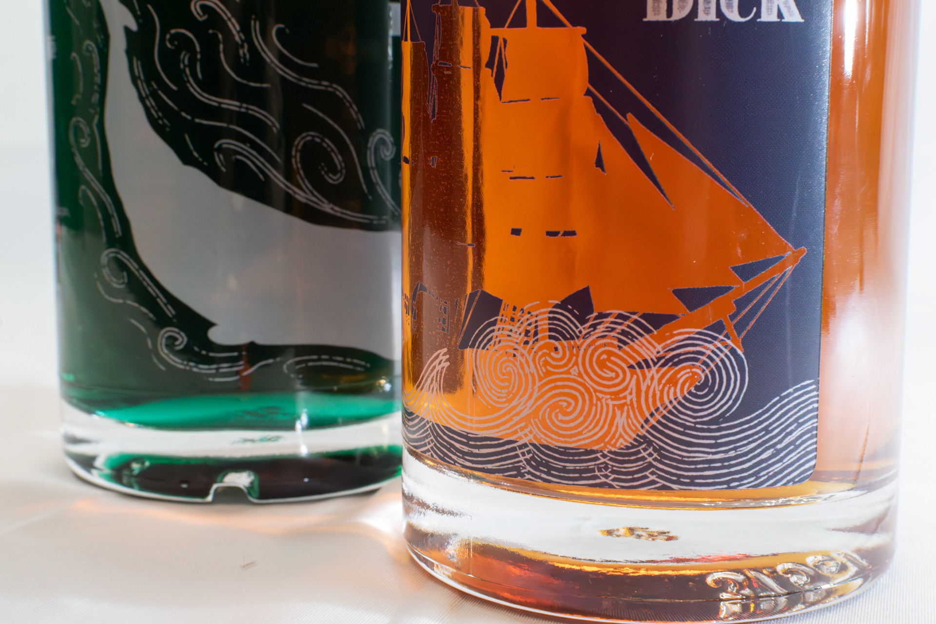
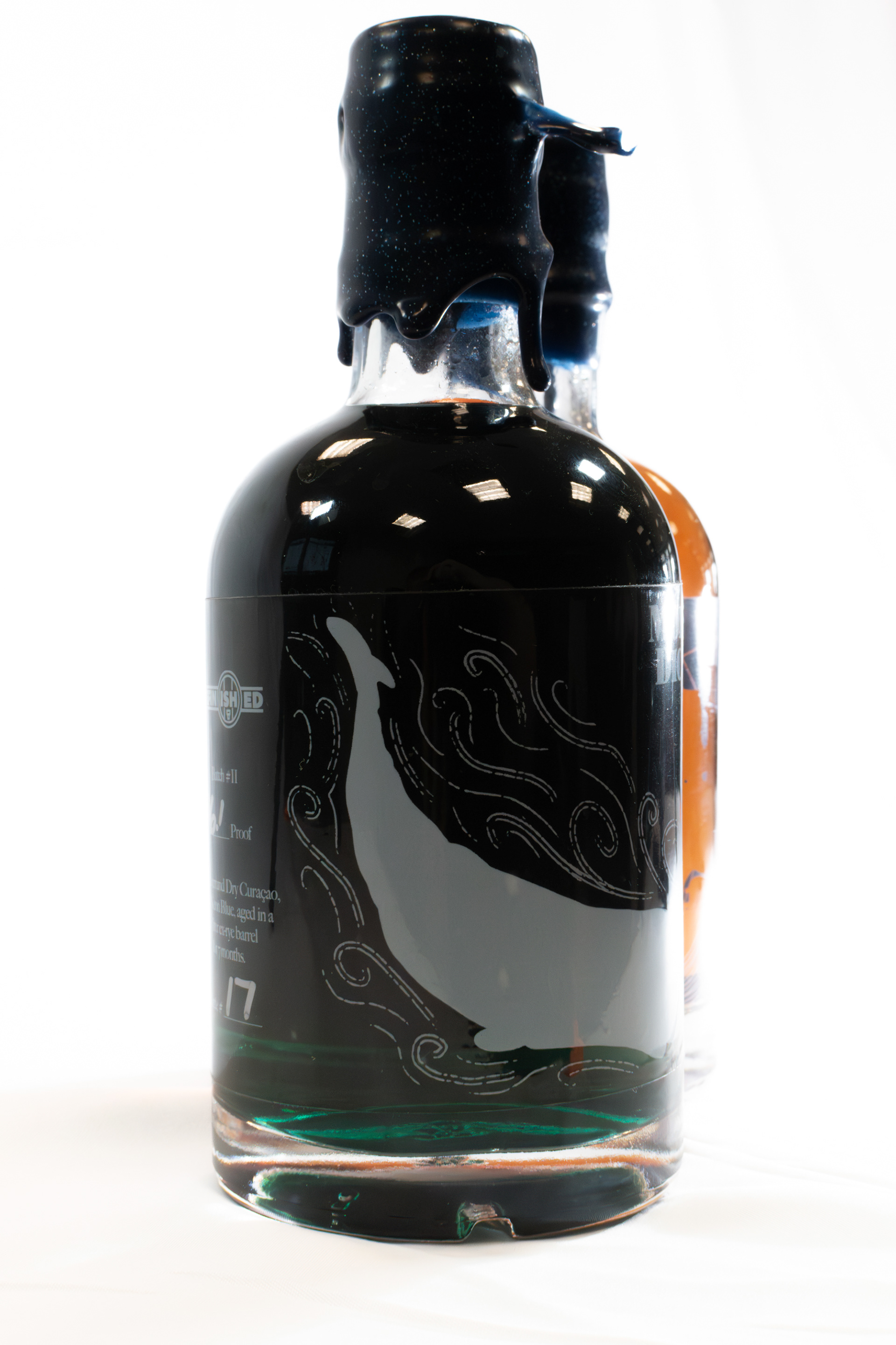
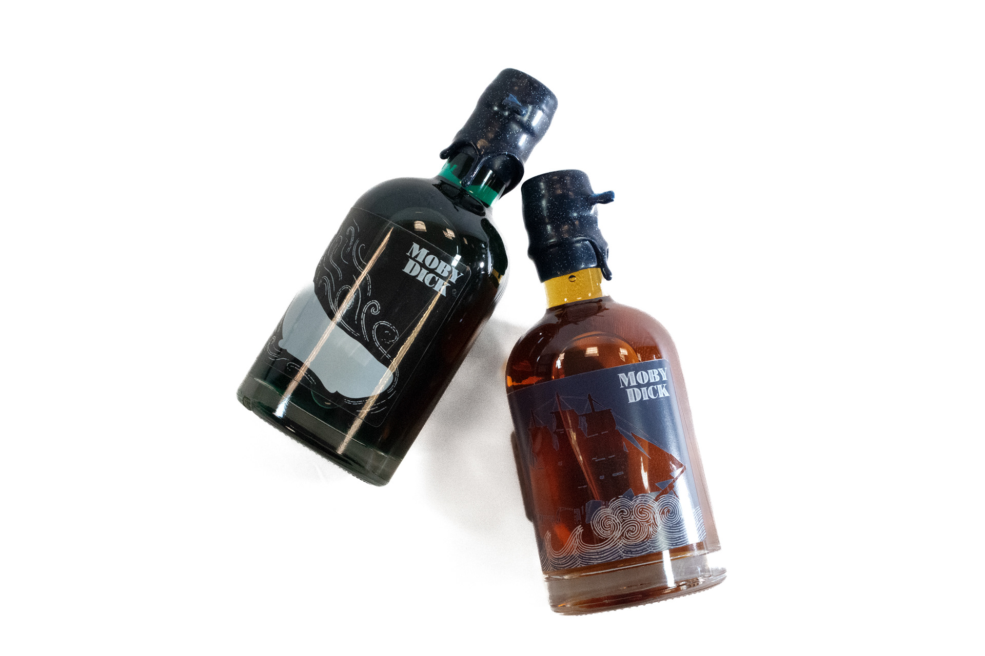
Refinished, a local whiskey refinishing company, asked me to create a label for their newest sister bottles named 'Moby Dick.' They wanted them to be inverses, one where the ship was transparent and one where the whale was solid, to create a stronger relationship between them. With a name like Moby Dick, you can only imagine something nautical with a little grunge.
Photoshop, Procreate
2021
2021
